
ThunderTix gives you powerful, easy-to-read analytics to help you make smarter decisions—whether you’re monitoring daily sales, identifying trends, or reporting to your board. With our interactive Dashboard, all your critical numbers are available at a glance and updated in real time.
Track performance by the day, by the season, or across years—with no complicated setup or third-party tools required.
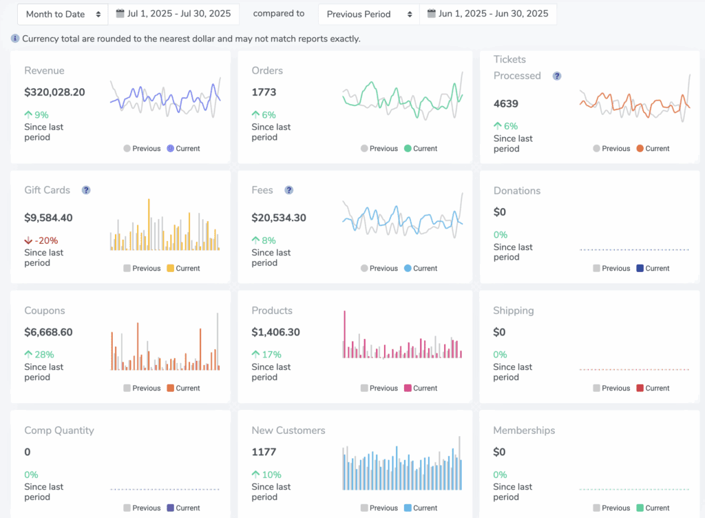
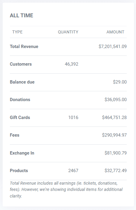
Total Sales at a Glance
Get a full snapshot of your organization’s revenue:
-
Ticket sales, donations, and products sold
-
Total fees earned (and kept—since ThunderTix doesn’t take a percentage)
-
Customer count and order volume
-
Gift cards sold and redeemed
Everything is available in one clear view—no exports or digging through multiple reports.
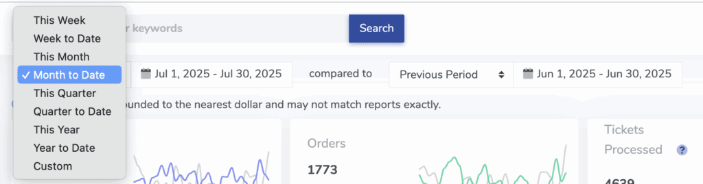
Custom Date Ranges & Year-Over-Year Comparisons
Need to compare July 5–17 this year against the same period last year? Now you can.
With ThunderTix’s custom date range tool, you can:
-
Select any date window
-
Instantly view sales, orders, and customer activity
-
Compare against the same range from the previous year for trend tracking
It’s never been easier to evaluate seasonal performance, marketing impact, or event growth.
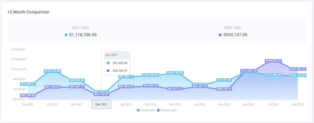
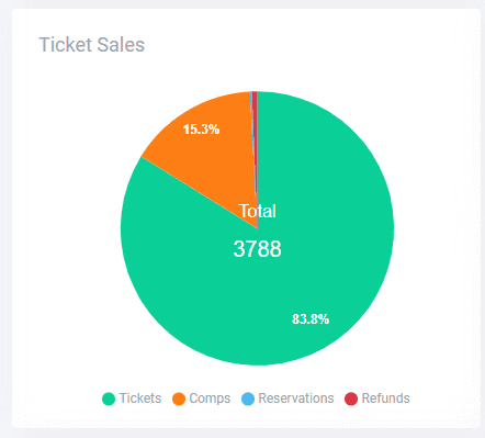
Real-Time Charts & Graphs
Visualize your data with intuitive graphs, including:
-
12-Month Comparison: View this year’s sales alongside last year’s, with comps stacked for visibility
-
Ticket Sales Pie Chart: Instantly see the breakdown of paid, reserved, refunded, and comped orders
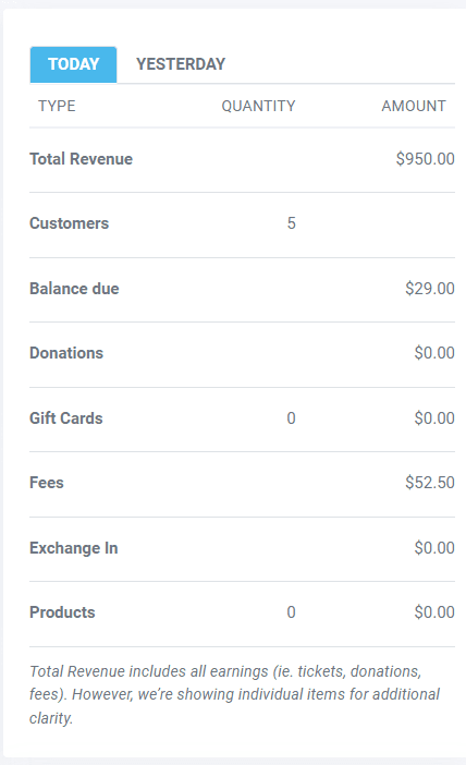
-
Daily Totals Snapshot: Compare today vs. yesterday at a glance—including orders, fees, donations, and product sales

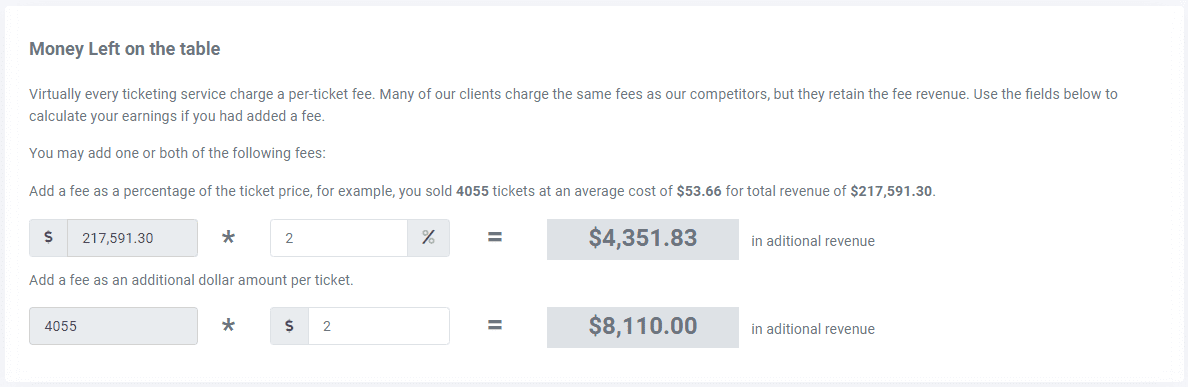
“Money Left on the Table” Insights
See what revenue you could have earned:
-
Calculate missed income from fees you chose not to charge
-
Understand the value of full control over your ticketing revenue
Most platforms keep service fees—ThunderTix gives you the option to retain 100% of them.
![]()
Unearned Revenue Metrics
Stay on top of unsold inventory and unredeemed value:
-
Tickets left to sell across active events
-
Unused gift cards and unsold merchandise
-
View what’s still on the table—so you can take action early
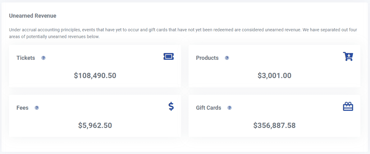
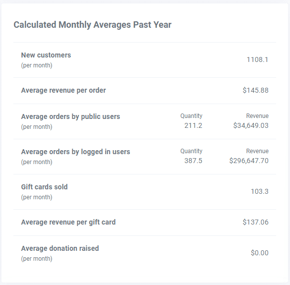
To the right of your unearned revenue from ticket fees, view averages over the past year on new customers gained, revenue per order, orders placed, and much more.
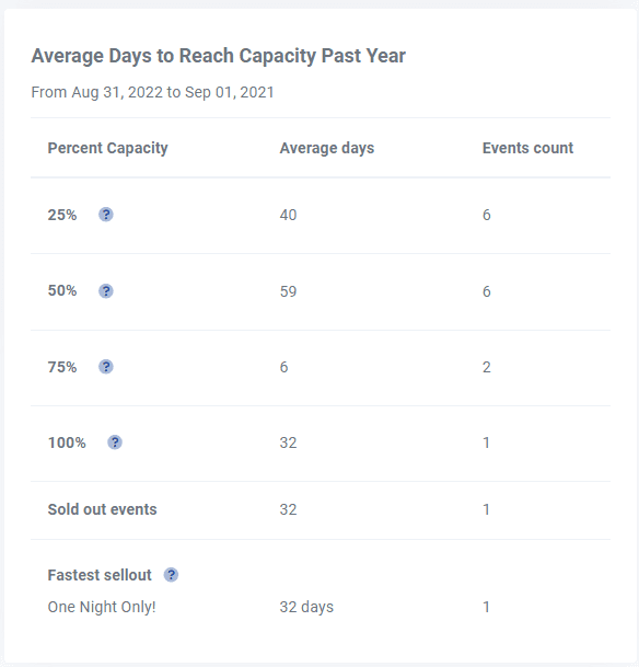
Understand Buyer Behavior
Want to know how long it takes for your shows to sell out? The Dashboard tracks:
-
Average time to reach 25%, 50%, 75%, and 100% capacity
-
Fastest-selling events across your calendar
-
How your audience responds to early announcements or promotions—valuable insight you can use to boost ticket sales and drive deeper patron engagement
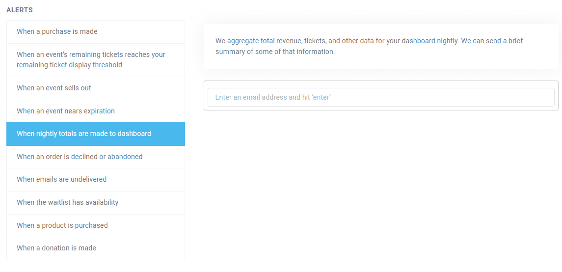
Optional Daily Email Snapshots
Enable daily summary emails so you can see your most important performance stats—even when you’re away from your desk.
If you have any other questions, check out our other report guides, the event reconciliation reports guide, and the ticket sales reports guide. For any further help, take a look at our event software reports video or visit our support forum.